Pantone recently revealed PANTONE 17-3938 Very Peri as the Colour of the Year.
Pantone LLC is a limited liability company headquartered in Carlstadt, New Jersey. The company is best known for its Pantone Matching System(Wikipedia).
According to Pantone, the colour is a dynamic peri(winkle) blue hue with a vivifying violet-red undertone. Encompassing the qualities of the blues, yet at the same time possessing a violet-red undertone, PANTONE 17-3938 Very Peri displays a spritely, joyous attitude and dynamic presence that encourages courageous creativity and imaginative expression. (Pantone)
About Pantone Color of the Year
The Pantone Color of the Year selection process requires thoughtful consideration and trend analysis. To arrive at the selection each year, Pantone’s color experts at the Pantone Color Institute™ comb the world looking for new color influences. These can include the entertainment industry and films in production, traveling art collections and new artists, fashion, all areas of design, popular travel destinations, as well as new lifestyles, playstyles, and socio-economic conditions. Influences may also stem from new technologies, materials, textures, and effects that impact color, relevant social media platforms and even upcoming sporting events that capture worldwide attention. For 23 years, Pantone’s Color of the Year has influenced product development and purchasing decisions in multiple industries, including fashion, home furnishings, and industrial design, as well as product packaging and graphic design.
A mix of warm blue and violet-red, Veri Peri is a fresh and uplifting colour. The blue depicts positivity, stability, and creativity. The violet and red undertone represent endless possibilities, joy, and hope.
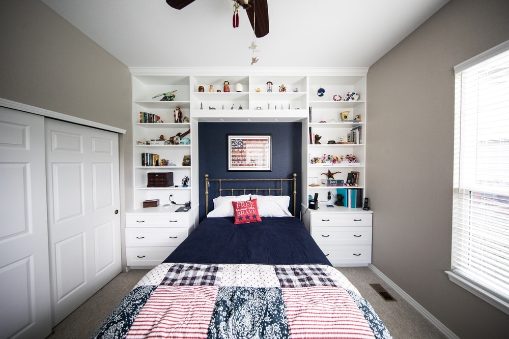
The last two years tested people’s endurance as we all faced tough times. As we battled adversity, we learned to be strong, to be hopeful in the face of dire times, and not give up even when the world around us was failing. In 2022, we have to continue to march ahead, keeping those learnings in mind. Not only adults, but children also suffered a lot. Cooped up in their homes, cut off from friends and relatives, these kids have experienced and gone through tough times. Now, with the world opening up, it is a chance to bring in colour not only to your kids’ lives, to their rooms as well.
Kids spend a lot of time in their rooms. It is their personal space and so a kid’s room should be bright and cheery. Colours can help in bringing vibrancy and set the tone of the room. It is no surprise that Veri Peri has caught the fancy of many kids. From preschoolers to teens, Veri Peri is a popular choice. There are a whole lot of possibilities available with this colour.
Here’s what we think about using Veri Peri for a kid’s room
This colour is a true representation of global spirit, transition, and future. It depicts innovation, transformation, and emotions. It is moody as well as mysterious and effuses serenity and calm.
- It is a versatile colour, and can be used in a variety of ways.
- There’s a sense of curiosity associated with this colour and using it in a child’s room would help in bringing in playfulness, positivity, and creativity.
- It is a gender-neutral colour, thus would be perfect for decorating boys’ or girls’ rooms.
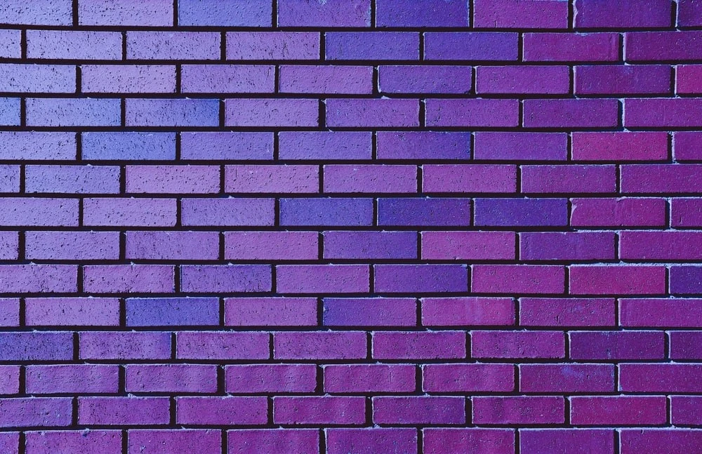
- It works very well for accent purposes. You can use it to either brighten a neutral space or dress up a wall for a bold look.
- It would work well on the ceiling as well. It helps draw attention to an otherwise ignored space.
- Since this is a colour inspired by nature, it would gel in well with other natural colours, like blue, turquoise, corals, emeralds, or any other shade of green.
- It also pairs well with whites, greys, oranges, yellows, or pinks.
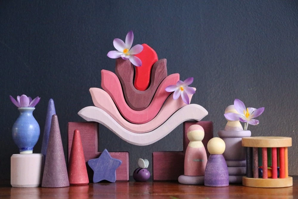
- It’s a multi-layered colour and would help in adding depth to the room.
- Either on its own or in combination with other colours, Veri Peri can bring magic to even cabinets, tables, desks, or wardrobes.
If you are apprehensive about introducing Veri Peri in your kids’ room in a bold fashion, but still want to give it a try, we would suggest you start small.
- Instead of painting the walls, you can add a dash of Veri Peri by getting throws, rugs, carpets, cushions, or pillows in this colour.
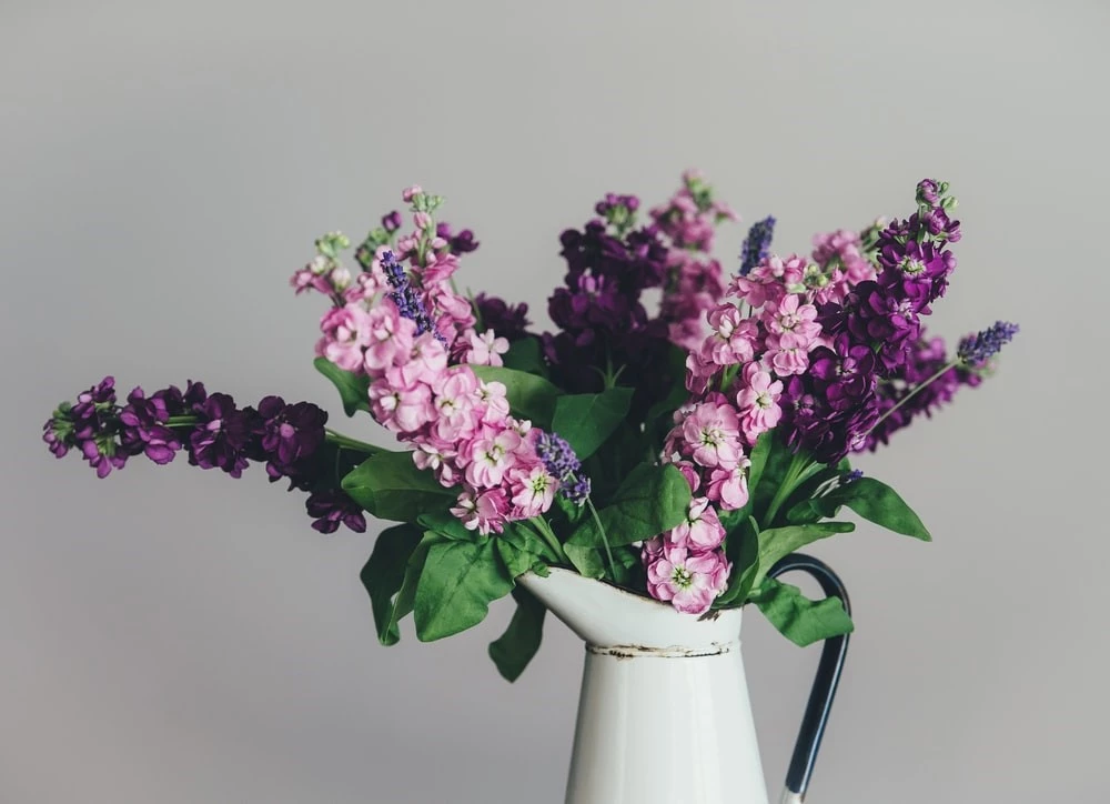
- You can also look at smaller accessories like towels, vases, picture frames, etc.
- Getting bedlinen, bedsheets, or curtains in Veri Peri are other subtler ways of incorporating this trending colour in your kids’ room.
- Painting one wall or making geometric patterns on a single wall is a low-cost way of highlighting Very Peri in your kid’s room.
In our opinion, Veri Peri would be a good choice to brighten and enliven your kids’ bedroom.
If you need ideas to design your kids’ room, our experienced team of designers is just a call away. Talk to us!