Colours play an important role in defining the tone of the room and setting the theme. You can easily transform the existing theme into another with the use of colours.
By changing the colour palette of the room, you can create contrasting patterns, give the room a geometric perspective, and use bold colours or even textured paint.
One of the easiest ways of uplifting a room is by changing the wall colours. Paint or wallpaper can help you in redecorating your room without any hassles. And the best part, it would not leave a hole in your wallet!
Depending on your style and taste, you can paint the room in bold colours or lighter shades. Each has its own advantage and disadvantage.
In this article, we will tell you all about pastel colours and how you can benefit from them.
What are Pastel Shades?

Pastels are not really colours on their own. Rather, they are shades of colours. They have a high value and low to medium saturation.
Their soft subdued shade is due to the inclusion of white in the bold shade. Pastels give us the characteristic features of the original colour as well as the brightness of white. E.g., pastel blue is blue with a lot of white. Similarly, pastel yellow is a mix of yellow and white.
A few years ago, designers and customers used pastel shades mainly in children’s rooms. The assumption was pastel shades were meant for the nursery. Now, the trend has changed. Pastel shades are now making an impact in modern living spaces.
They have an inane charming appeal. They are suitable for all rooms of the house.
By using pastel shades, you can create a relaxing atmosphere. Your living room or bedroom will appear more tranquil and welcoming.
You can either paint a single wall, or all the walls or just create a pattern.
Soft pink, light blue, lavender, mauve, lilac, and light green are a few of the most popular pastel shades. Whereas, soft peach, mint green and fresh lemon are seen more in the contemporary styles.

- Light airy grey opens up the walls and makes the room look bigger. It is important to use the right shade. A darker shade of grey would make the space appear cramped.
- Light blue-green is a beautiful shade. It does not just remind one of nature, it also has an openness associated with it.
- Another shade that reflects the beauty of nature is light blue. Pale blue is soothing and is associated with the vast open skies.
- Blush pink or soft pink reflects light and makes one feel they are in a larger room.
- Taupe is another favourite pastel shade. It gives the room a modern and ventilated feel.
Not just walls, but even textiles and furniture in pastel shades can help you in transforming your space. Curtains, cushions, pillows, bedlinens, or even tables and chairs in these soothing shades are welcoming. A similar tone of the hues would make the room more calming.
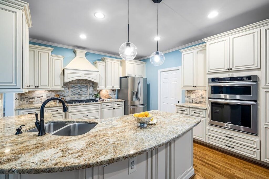
If you are looking for colour ideas for the kitchen, we would recommend pastel pink, pistachio green, or lemon yellow. When combined with a darker kitchen slab and flooring, pastel shades will make your kitchen alluring. Nowadays, even appliances are available in pastel shades.
Working with pastel shades offers a lot of flexibility and there is no limitation on the number of outcomes you can achieve. You can even mix and match them with muted tones. Soft grey with purple is refined as well as calming.
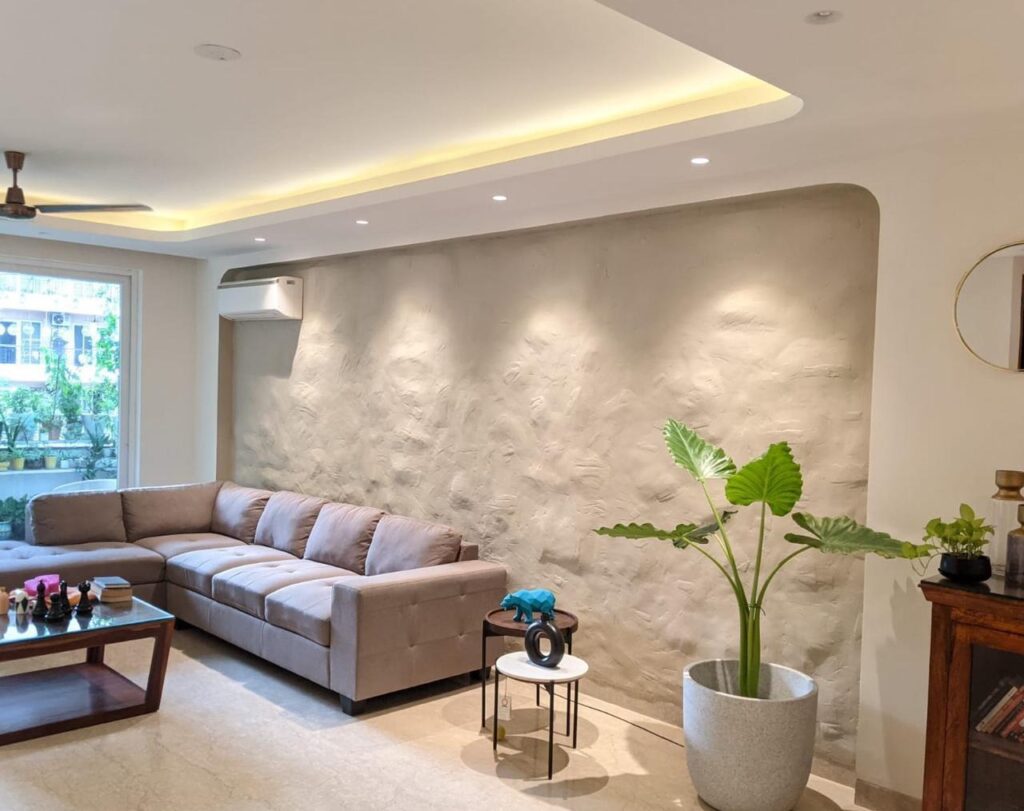
You can either paint a single wall as a feature wall or select a statement piece of furniture for the living room to leave an unforgettable impression. Neutral tones and pastel shades gel well if you are looking for a muted décor. This combination is subtle, yet appealing.

Pairing earthy textures and deep tones with a pastel palette help bring a unique flavour. If your walls are in pastel shades, we recommend dark-coloured floors like wooden floors or dark tiles. Wooden panels, cabinets and furniture etc provide a good contrast element.
If you want to give your living space a lot of character, mixing pastels with bold patterns is the best way to go about it. Pastels need not be light always. They can be bold and uplifting if you pair them with vivid tones.
Metallic shades can be added to bring in intrigue and a variation in texture.
An important tip
Always select a shade one or two levels lighter than the one you like on the shade card. Pastel shades turn slightly darker after drying.
If you wish to create an illusion of space, pastel colours are your best bet. A pastel colour palette makes a small room look much bigger than it actually is.
If you are looking for redecoration ideas, reach out to us. We will be happy to share our ideas with you!