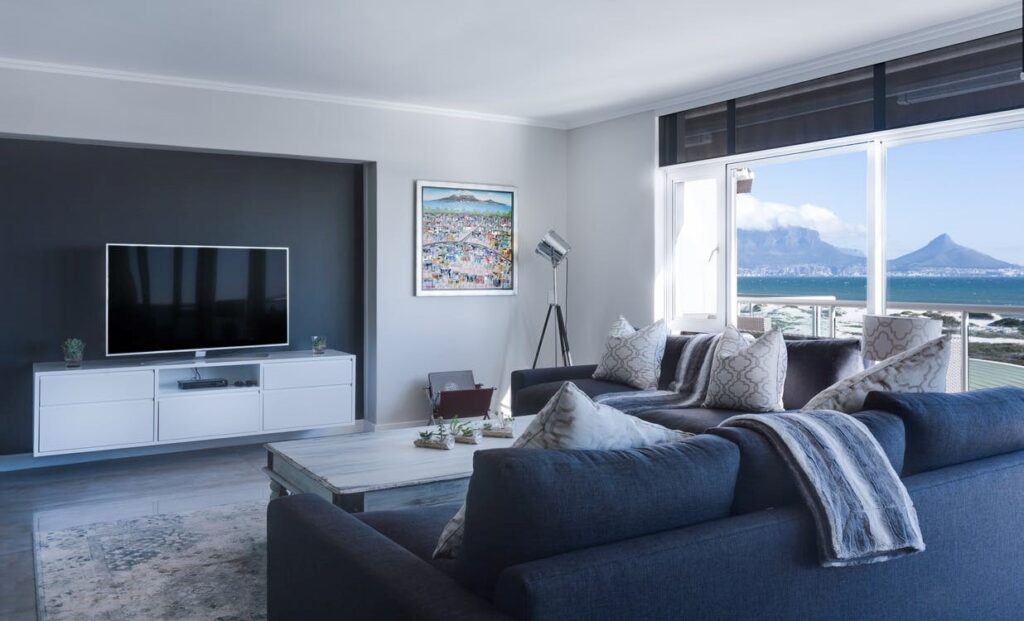
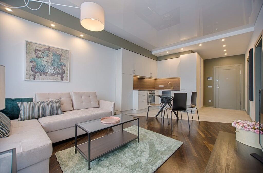
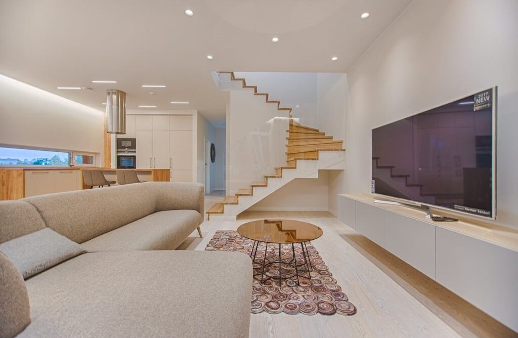
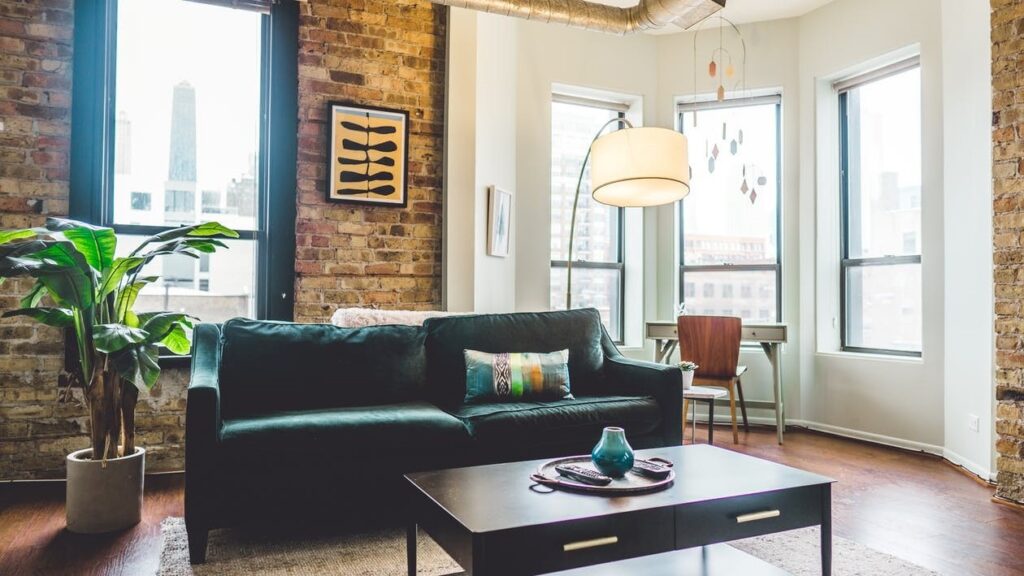
The living room is the most used space of every house. It is important to make this space personalized, comfortable, and cozy. But sometimes your living room might fail to live up to your expectations. The reasons could be one thing or too many things.
If you are in the process of designing or redesigning your living room, you are at the right place. In this article we look at the 10 most common mistakes people make when designing their living room and how best to avoid—or fix—them
- Cohesiveness

Most often clients do not focus on making a cohesive living room. Your room should communicate a singular message. The furniture items and accessories should belong together, instead of in isolation.
- Instead of picking objects/artifacts from stores in a random fashion, think of the overall pattern first.
- Repeat colours, textures, patterns, shapes, design styles of different elements to create rhythm.
- Any new purchase should work well with the fixed elements you already have.
- No item works in isolation. Colours, furniture, décor pieces have to work together.
2. Don’t fall for the showroom look.

- The living room should have enough variation in terms of colour palette.
- If your chosen colour is red, instead of having the walls, cushions, décor items of the same colour, go for variation.
- Consider the different tints, tones, and shades of your chosen hues.
- A mix of shades or even colours brings in an interesting and nuanced look.
3. Don’t fall for the showroom look.

If you are thinking of buying an entire living room set from the local furniture shop, let us remind you that even though it looks cohesive, it would lack personality. It is not unique, doesn’t reflect your tastes and worst of all, your neighbour might end up picking the same set!
- Focus on the overall look you want to create.
- Spend time on selecting individual pieces so that they reflect your taste and suit your needs
4. Rug size

It may seem to be unimportant, but the size and positioning of the rug play an important role. One of the common mistakes is getting a small size carpet that barely fits under the coffee table alone. The end result is, you have a bath mat in your living room, instead of a carpet.
- Either you can have a wall-to-wall carpet that covers the entire living room
- Or place the carpet in such a fashion that the front legs of the sofa can rest on it. The ideal scenario would be all the legs resting on it.
- Never have three legs of a chair on a sofa and the fourth one on the floor. It would make the chair wobbly.
- Group the furniture centred on the rug.
- Edges of the rug should not stick out on the pathway or curl up, as it might lead to people tipping.
5. A problem of plenty

If you have too many furniture pieces in the living room, there won’t be enough breathing/moving space around furniture. There should be enough space for comfortable movement around the furniture. The space should be accessible to all. Also, if the living room is jam-packed with furniture, it would appear too cluttered. The end result would be an uninviting and unappealing living room.
- Have proper spacing between furniture.
- A space of about 14-18” between the sofa and coffee table gives enough movement space.
- Avoid placing too many breakable items on the coffee table.
6. The role of lighting

Lighting plays a massive role in perceptions. Not enough variation in lighting can make the room less dynamic. A single overhead light is easy to fix and easier on the pocket. But it would not make the room appealing.
- An adequate amount of ambient, task and accent lighting would create an environment that would be interesting and functional.
- Layering different kinds of lights like LED strips, lights at different height levels, table lamps, floor lamps, task lighting on sides of sofas can enhance the overall appeal.
7. A bland living room lacks personality and is boring.

Your living should have charm and appeal. A dull lacklustre room would dampen the spirits of the occupants.
- You can bring life to your living room by incorporating your likes.
- Think of the colours, designs, or styles that appeal to you.
- Combine different design styles.
8. Furniture placement

The idea behind a living room is mainly to have comfortable conversations with friends and family members. If the sofas/ chairs are pushed too far apart, it lacks coziness and people would have to even shout to make themselves heard if the room is large. This can be rectified by focusing on creating a comfortable conversation area.
- Try not to push all the furniture against the wall.
- Try to place furniture in such a manner that people are able to face each other while seated.
- Create an angle with the seating by positioning the sofas and chairs at a 90-degree angle to one another.
- Spread out the big pieces of furniture across the room instead of arranging them all on one side of the room.
- Don’t position the sofa with its back to the entrance.
- TV should not be placed too high. It would cause eye strain and neck strain.
9. Traffic flow in the living room.

Navigating around multiple furniture pieces or knocking off breakable items while moving around is an unpleasant experience. It is due to a block in the traffic flow.
- Understand the traffic pattern of your room
- Remove all obstacles from the path like chords, wires, etc.
- Traffic should be around the conversation area, rather than through it.
10. Go the Mary Kondo way

Clutter is the biggest enemy of a well-designed living room.
Don’t keep things you don’t like anymore. With time our tastes change. There’s no point in clinging on to items if they are not going to make your living space better.
Hope you find this article helpful, and in case you want to discuss your requirements, we are just a call away. Please feel free to reach out to us for the best living room design ideas and solutions.
