Client: A Gurgaon based couple – Abhinav and Dipti (full House Renovation)
Where: DLF Newtown Heights, sector 86, Gurugram
Client’s requirement: Remodelling of their 3 BHK apartment with total area of 1800 square feet.
Our role: To refurbish and renovate full House Renovation to the client’s requirements.
Video : Youtube
Our process:
In the initial meeting, we sat down with the client and understood their requirements. Our clients were well prepared and knew exactly what they wanted in terms of the style, layout and overall full House Renovation. They had done a lot of research online and had an overall idea of how they wanted their home to look and feel.
In the next stage, we focussed on translating our client’s requirements and ideas to paper. Our team of designers prepared intricate designs with immense attention to detail room-wise. These were then shared with our clients for their approval. We gave them 3D designs with varieties of colour palettes and colour schemes for them to choose from.
Once we received their approval, the actual task started.
Process of full House Renovation
The foyer area which was once plain was renovated with a beautiful feature wall. The bright pink colour, jharokhas and mirror work added immense charm to the entrance and brightened up the space that was dull earlier. The clients also needed a shoe rack, and we incorporated it as well in the foyer area.

In the Living room, the clients wanted to highlight one wall. So, we used a combination of white and golden on a wall. The colour combination worked perfectly with the client’s yellow couch and provided a cohesive look to the living room. We also added a wooden partition to both uplift as well as divide the space. Our clients were concerned about enough space to accommodate all their existing furniture, and we took care of it with meticulous planning and designing full House Renovation. Also know more about home automation read more.


Clients Requirements
Our clients wanted the Dining area to be colourful and reflect the spirit of the entire home. Here, we designed a feature wall in teal and gold with a large penny-farthing motif in the centre. We also added a dining cabinet in wood and glass for display and storage of cutlery and crockery. The addition of a breakfast counter helped to bring seamless integration with the open kitchen. The overall colour scheme of teal, white and brown perfectly suited the client’s desires. An open bar added vibrancy to the area.

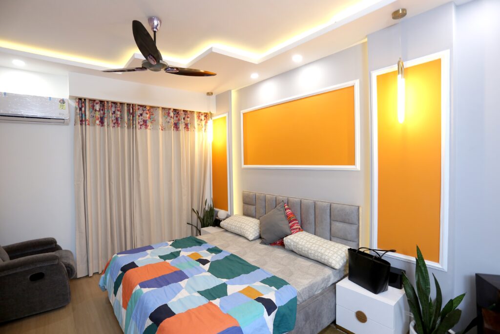
In the Master bedroom, the clients had a specific colour scheme in mind considering their existing furniture items. We worked with their desired colour palette, and also highlighted the wall behind the bed. The feature wall added charm and intrigue to the room. To take care of their storage requirements, we placed wardrobes, a TV console and a dresser on one wall. The wardrobes in white with gold-coloured stripes blended in nicely with the rest of the décor.


We renovated the washroom attached to the master bedroom to give it a modern and trendy feel. A sleek counter-top basin replaced the earlier under-mount one. Also, the water closet was replaced with a wall-mounted closet with an in-wall flush system. Darker coloured tiles replaced the lighter ones. We also added a small four-blade ceiling fan for increased ventilation, a transparent partition and open shelves to make the space more functional. These simple modifications enhanced the aesthetics and appeal as well.


The kitchen was transformed considering the client’s preference for a darker colour. Countertops, cabinets and tiles were redone in a new colour scheme – black, white and brown. The dark colour scheme worked really well and completely transformed the space from a plain utilitarian one to a trendy and desirable one. We designed floor to ceiling cabinets to take care of the storage needs and made the kitchen clutter-free. A gas hob replaced the gas stove, which further enhanced not only the aesthetics but even the safety aspects.


According to the client’s desires, we remodelled the third bedroom into a study room. The clients wished for a space where they could unwind and relax after a hard day’s work, hence, the layout, colour scheme and furnishings were chosen accordingly. This room has a very soothing appeal and leaves one re-energised.


We redesigned the guest room in a soothing colour scheme – white and lavender. We brought in cohesiveness by extending the colour scheme from the walls to even the furnishings, curtains, and ceiling fan. Instead of a feature wall, we played with colours on the false ceiling and it acts as a highlight in this room.


The clients had two balconies in their home and both were redecorated. The redesigned balconies are a reflection of the client’s fondness for nature. Green carpet, waterfall, plants and delicate animal figurines helped bring the outdoors right into the client’s home.


Similar to the washroom attached to the master bedroom, we redecorated the guest bathroom and Powder room too. Wall tiles, water closet, washbasin and cabinets were replaced to achieve a trendier and more cohesive look. This washroom is in earthier tones as compared to the black shade of the other.


Conclution
We started working on this project in November 2021 and handed over the complete project in February 2022.
In this renovation project, we focussed on enhancing the functionality, aesthetics, and overall appeal of our client’s home. We paid attention to including false ceilings, varied lighting, a differing yet cohesive colour scheme, increasing storage and paying close attention to our client’s needs and desires.
Our intent was to create a more functional, ergonomic home for our client with better flow and storage.
It gives us immense satisfaction to state that our customer’s joyful experience is a testimonial of our professionalism, talent, and ability to deliver what we promise.
Please feel free to get in touch with us if you too wish to renovate your dream home.
